

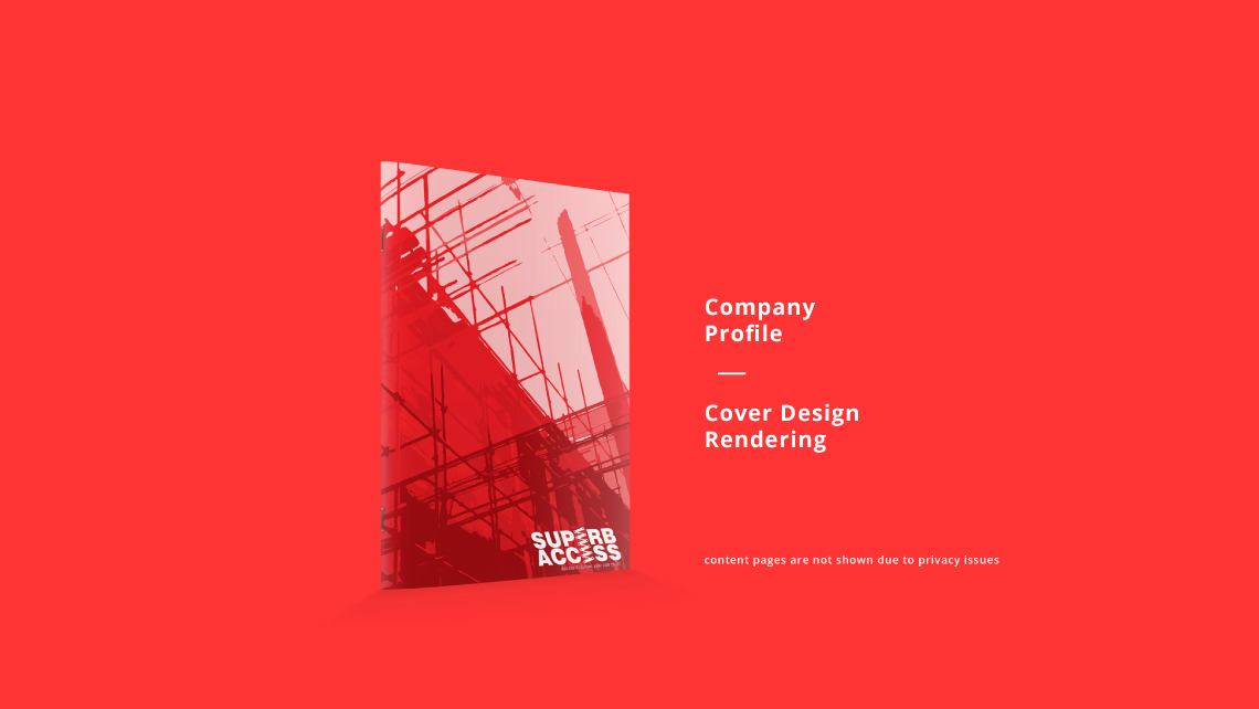
Project Details
Client: Superb Access Sdn. Bhd.
Brief: Logo Rebranding
Design by: Kingsley Shin


The new logo design will carry the brand to future, moving aways from stagnant boring typeface to slanted/itallic wordings, creating forward movement. The brand name are often misspell as "super-access" instead of "superb-access", removing the letter "E" & replacing it w/ graphic elements will draw out the attention, thus reader will only render the 1st & last letter to construct the word "superb". The letter "E" is replace w/ scaffolding icons, creating awareness toward the nature of business.
The most difficult part of this project is to maintain the outlook of the logo to look identical to the old logo. We choose to preserve the colors; forms; silhouette; & font-type for the logo. A risky move, as the client may think that we did minimal to zero effort on the project. The decision turn out to be fine as the client seems to have faith in us.
This is a good case study where creativity is needed rather than execution skill. We must 1st understand the client's needs/concerns; the market & targeted audiences. The client valued their logo as a trademark fro years, so changing the trademark may lose the familiarity.
The final logo are able to showcase characteristics & the design create a strong image (looks like an oversea company) for the brand to compete in the local Malaysia market.